brand
guidelines
An evolving resource for confidently working within the standards of the Motion brand.
we are the results-driven creative marketing agency giving brands the power they need to accelerate growth
who we are
our positioning
Motion is the results-driven brand growth agency.
To health, wellness, consumer and durable brands with a challenger mindset, Motion is the results-driven brand agency that accelerates growth for our clients' businesses by designing and executing smart, data-driven marketing strategies that help them achieve and surpass their goals…faster.
our history
our boiler plate
Motion, a certified woman-owned business, is a full-service integrated marketing communications agency that has been named one of the nation’s fastest growing agencies by both Inc. Magazine and Adweek, as well as a Top PR Agency in America by Forbes.
Motion has in-house marketing experts dedicated to virtually every kind of discipline including strategy, branding, design, content, social media, PR, production, and digital development, all working in concert to propel clients forward using the agency’s proprietary accelerated growth approach. Motion delivers extraordinary brand experiences for clients across the consumer, healthcare, non-profit, building products, manufacturing and B2B industries with a client roster featuring numerous Fortune 500 companies.

Copy boilerplate to clipboard
agency values
To be successful in Motion, use F.O.R.C.E.
be Forthright.
Work with integrity. Keep promises, build bonds, and remain forthright in all that you do. Be honest, sincere, and transparent, treating clients and coworkers with respect, and as you would want to be treated.
be Open-minded.
Listen carefully and engage thoughtfully with everyone you meet. Never rush to judge. Consider the thoughts and feelings of others before you speak or act. Treat diversity of perspective as if it were an agency superpower.
be Resilient.
Stretch, bend, and be willing to jump in new directions. Approach challenges with a growth mindset. Be nimble–receptive to changing things we can, and resilient in overcoming those we can’t.
be Challenge hungry.
Strive to perform at your personal best. Push yourself and those around you to bring maximum effort and fresh thinking to bear on every project you touch. Don't accept the status quo. Seek better ways to do what we do, challenging clients and colleagues to stand apart and rise above.
be Entrepreneurial.
Be a self-starter. Take the initiative. Roll up your sleeves. Hustle. Identify opportunities to exceed expectations and run with them. Anyone can lead, and everyone has the potential to open new doors to success. Don’t wait to be told; be proactive. Grab a hold of those reins and go.
our brand voice
The Motion brand voice is confident, knowledgeable and approachable.
confident
We’re comfortable in our skin. We know who we are. We know what we’re capable of and eager to prove it.
"we can help you"
knowledgeable
We know a lot about a lot. We’re curious about the world and interested in how things work. We’ll gladly share what we know with anyone who will listen.
"you can trust us"
approachable
We’re easy to talk to. We’re relatable and down to earth. We’re good listeners and genuinely interested in others.
"we're easy
to work with"
Headlines
On the website and in some presentation materials, headlines are lower-case, bold, and unpunctuated. Visit agencyinmotion.com for examples. These headlines are typically used sparingly as eyebrow or section headers, with the secondary headlines or H2 headlines written as sentence case.
Subheads
Use a lot of subheads to help skimmers skim, and always use sentence case. In most cases, subheads will not contain periods.
Paragraphs
Generally speaking, try to keep them short. Always look for opportunities to break up long paragraphs into short ones. For longer form copy it is permissible to have longer paragraphs, but anything that will appear in digital media should be as brief and scannable as possible, especially for anything that will be viewed primarily on a mobile device.
Bulleted lists
Use bullets or lists frequently to make content more scannable, and don’t put periods at the end of each bulleted item.
Conjunctions
Our communications should have a knowledgeable yet approachable and confident tone. Conjunctions (we’ll, it’s, can’t) are to be used wherever possible.
Job titles
When a job title appears directly in front of a person’s name (e.g., speaking at the event will be Senior Product Manager John Smith), use initial caps. When the job title appears after a person’s name (e.g., John Smith, senior product manager, will speak at the event), do not use initial caps. Lengthy job titles (those of four words or more) should generally appear only after a person’s name.
Numbers
In headlines, when it makes sense, use a numeral (The 5 Ways You Can Outsmart Hackers). In copy, we generally spell out the numbers one through twelve and use numerals for everything else.
Chart/graph titles.
Sentence case in all cases
punctuation
Commas
We prefer to use the serial comma in longer body copy whenever possible for clarity, and because it is never incorrect to use a serial comma (Example: “We would like to thank our clients, Denzel Washington, and The City of Chicago“ VS. “We would like to thank our clients, Denzel Washington and The City of Chicago.”).
The serial comma may be omitted, however, on a discretionary basis to accommodate for space/character counts, when line breaks in layout create a comma-like pause, or when it is determined editorially unrequired by the writer.
Em dash
Be sure there is a single space before and after the use of an em dash in copy.
Hyphens
Use them to combine two or more adjectives into one when it makes the writing clearer (hard-working IT staff, forward-thinking executives), but never after an adverb (highly talented engineer, traditionally configured environment).
Exclamation points
As a general rule, avoid the use of exclamation points whenever possible. They can make the message seem breathless and insubstantial or make the copy tone sound like shouting; there are few instances where one is appropriate.
primary brand mark
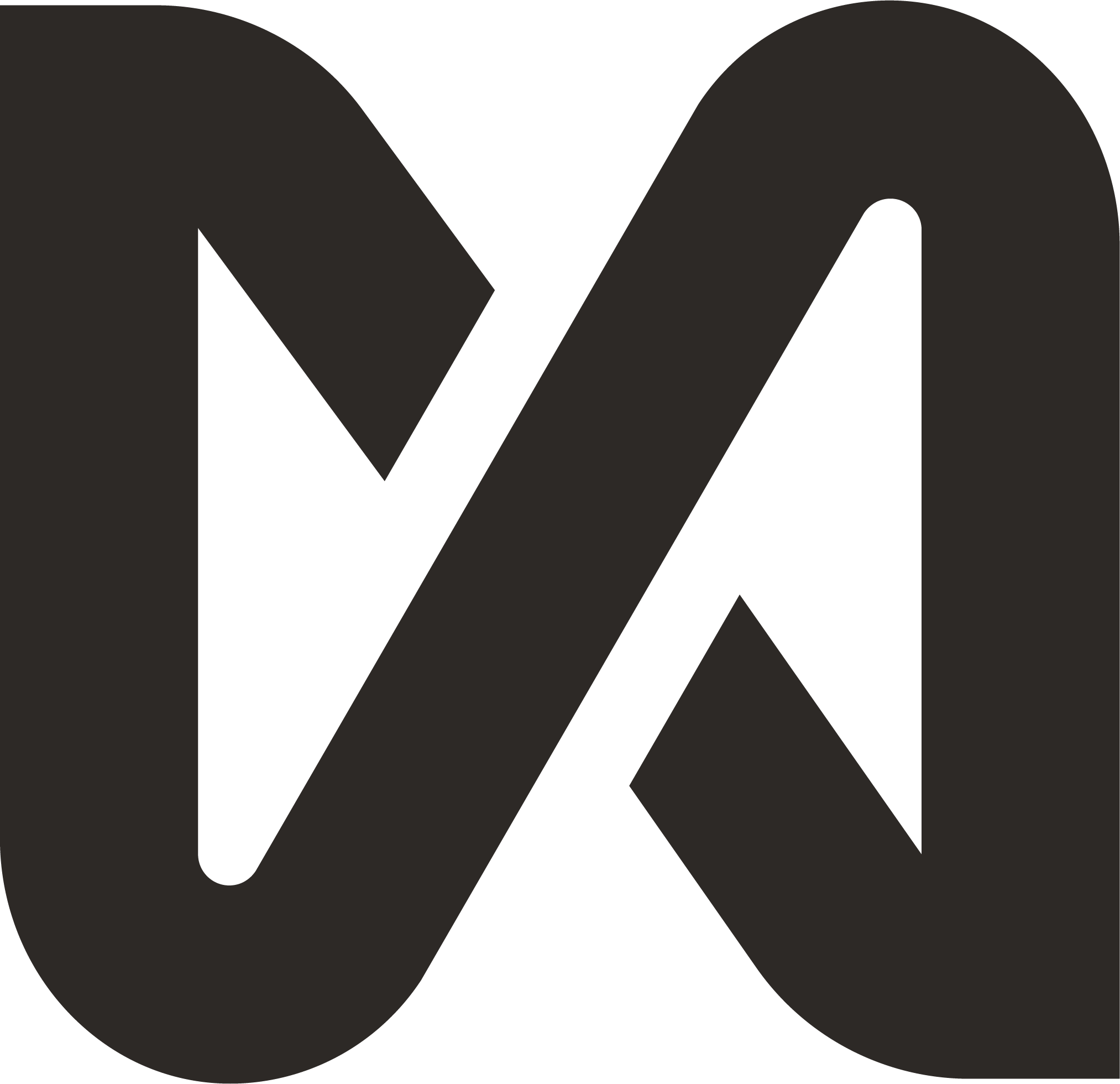
The Motion wordmark is a custom mark based on the Halyard typeface. The wordmark is always Black or White.
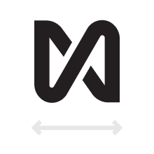
motion mark
The Motion mark is primarily used in social or animated instances. The primary wordmark and motion mark are never used in the same instance.
construction and clear space
The Motion primary wordmark should be surrounded by a clear space using the overall height of the mark around all sides.
The Motion mark should be surrounded by a clear space using the overall height and width of the mark around all sides.
minimum size requirement
The minimum allowable size of our brand wordmark is .65 inches wide
The minimum allowable size of our brand emblem is .275 inches wide
brand palette
Our brand palette feels energetic and diverse, with a mix of neutral, warm, and vibrant colors that represent a fun yet grounded brand identity. Click color to copy HEX code.
Additional hues can be found here for illustration purposes.
accessibility
Any combination of colors must adhere to ADA Compliance. Ensure maximum contrast. Access color contrast checker here.
type guidelines
Weight
The Motion brand exclusively uses the four weights of Halyard listed above.
Case
We use sentence case for most communications. All-lowercase type is used only for headlines in the black font weight. Sentence case can be used for subheads. All caps is for eyebrow copy only.
Justification
Our type is always left or center justified.
Tracking (letter spacing)
Our typeface uses 0 tracking by default. If spacing needs to be adjusted, make sure letters never touch
type hierarchy
EYEBROWS ARE 1/6 HEADLINE
headline
Subheads are 1/3 headline
Body copy is 1/5 headline size when subheadlines are present, like this example. In applications where subheadlines are not present, body copy can be either 1/3 or 1/2 the headline.
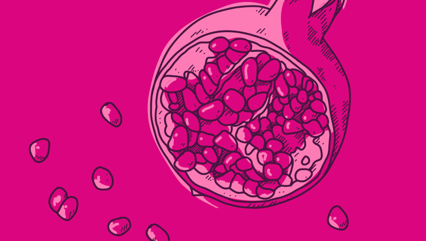
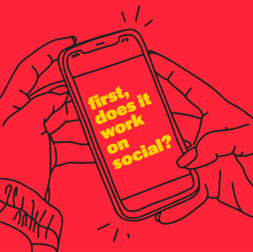
illustration principles
Our illustration is:
Effortless
Engaging
Lively
Delightful
Our illustration is not:
Complex
Literal
Static
Intricate

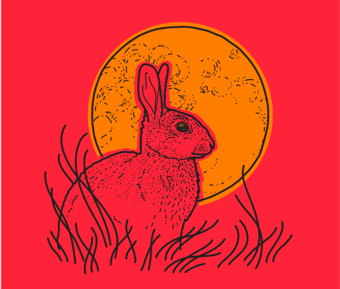

iconography
Our illustration style follows our design framework.
Clean geometric shapes and lines reflect our illustration style.
illustration color palette
These colors are only used in illustration for contrast purposes.
The palette includes 3 additional sets of hues. Black and blue should be primarily used.
Click color swatch to copy HEX code
templates
This section offers essential resources to support projects with on-brand templates and systems. As our resources grow, it will remain a central hub for materials aligned with our brand standards, helping you ensure consistency and quality across all brand implementations.
Questions?
Contact brandguidelines@agencyinmotion.com for further assistance.