A Conversation with Motion’s Creative Branding Experts
As brand builders, the creative group at Motion loves a strong, distinctive brand identity—one that doesn’t just stand out but also stands for something.
We also believe a great brand identity can be so much more than a cleverly designed logo or a witty tagline. Done thoughtfully, an identity can be an entire ecosystem of interlocking parts that work in harmony to command attention, evoke emotion, build trust, and/or appeal to any of our four core human desires: belonging, security, purpose, and achievement.
Seems like a lot for a brand to accomplish, yet every day people are feeling things like comfort, confidence, inspiration, and pride just by clicking a brand logo on their smartphone, reading a branded email, or carrying a branded bag out of an outlet. This is the power of a well-built brand, and these powers aren’t born with the brand, they’re imbued by the builders. And reinforced over time by a commitment kept
To highlight what we believe makes a brand identity exceptional, I sat with several of our top creative minds to discuss and dissect a few current brands they admire most.

Duly Health & Care: A Study in Simplicity and Sophistication
Joe Popa, VP Design Director
“Healthcare is a vast, evolving industry. in recent years, we’ve seen hospitals and health systems rebranding aggressively just to stay competitive. But branding in healthcare can be uniquely challenging because ideal consumer engagement with your brand is paradoxically low. What I mean by that is, a healthy person doesn’t need a hospital—so they will have low-to-no engagement with your brand. Until something happens and then, suddenly, they do. So that moment of engagement is critical.
“When thinking about health care brands, in particular, I challenged myself to consider: if I had zero knowledge of my area’s hospital networks, how would I choose one based solely on their branding? To color in this hypothetical a little more, let’s assume I have to make this decision for my family presented only with a logo garden of hospitals in my service area. Based on this limited data set, I determined I would probably choose Duly.
“Duly Health & Care has executed a brand identity that is both fresh and reassuring. The name ‘Duly’ is novel yet familiar, short yet meaningful. Its logotype is crafted with an elegant interplay of tension and harmony. The bold verticality of the letterforms conveys stability, while the subtle calligraphic details add warmth. The most compelling visual element is the ‘u,’ which folds back on itself, introducing a soft blue accent against a navy foundation—a small design decision that elevates the entire mark.
“Equally impressive is their tagline: ‘Health and care, dually.’ A simple phrase, yet packed with meaning. Instead of a flat descriptor, the tagline integrates conceptually with the logo, reinforcing the brand’s core mission in a sophisticated and memorable way.
“We kept this level of strategic craftsmanship in mind at Motion when we did the rebranding for Midwest Orthopaedics at Rush. Looking ahead to 2025, we’re excited to continue evolving that identity across digital and experiential platforms.”

Airbnb: The Art of Experience-Driven Branding
Christy Cardona, Senior Art Director
“When thinking of brand identities I admire, one really stood out to me: Airbnb. And while it’s not a challenger brand, it still feels like it’s challenging the status quo in hospitality.
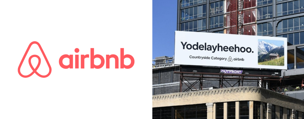
“Airbnb has mastered the balance of function and personality, delivering a brand identity that is seamless, engaging, and deeply human. The app itself is intuitive, but what sets it apart visually is its use of custom illustrations. Unlike competitors, Airbnb doesn’t just rely on stunning photography; it enhances the user experience with bespoke illustrations that make destinations feel personal and inviting.
“Their marketing follows the same philosophy. Airbnb’s billboards are a masterclass in concise, witty copywriting paired with striking visuals. Ads like ‘Go shorty’ (for their Tiny Homes category) or ‘Yodelayheehoo’ (for countryside stays) are simple yet packed with personality. This kind of clever, culturally relevant messaging makes the brand feel adventurous and approachable—a rare feat in the travel industry.
“Airbnb’s identity is one of those that feels almost effortless, when in reality you know every touchpoint has been strategically designed to reinforce the brand’s warmth and authenticity.”

Lovevery: Montessori Meets Modern Minimalism
Stefan Castellanos, Associate Creative Director
“A few years ago, I might have picked an emerging beer brand like Modelo, but right now, the brand that’s been catching my attention is Lovevery.
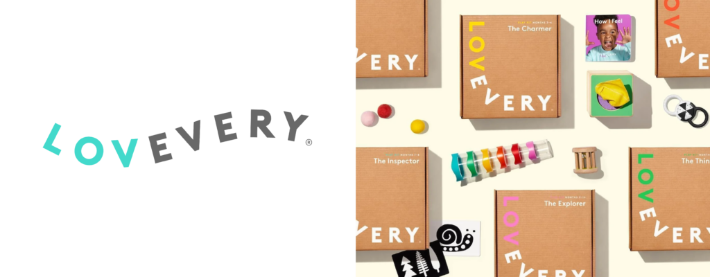
“This Montessori-inspired toy company has created an identity that disrupts the conventional toy market. While many children’s brands have leaned into tech-driven, hyper-stimulating products, Lovevery has gone in the opposite direction. Their branding exudes confidence in simplicity:
- A research-backed, development-focused positioning
- A design aesthetic that is low-tech yet modern
- A brand tone that is informative but never condescending
- A premium price point that unapologetically sets them apart
“Their visual identity is equally strategic. The logo is playful but restrained. The wide but consistent color palette is bright yet soothing. Their typeface is simple but distinct, creating cohesion across packaging, books, mobile app, and social media.
“Lovevery has struck the perfect balance between Montessori tradition and contemporary branding, making it resonate with a new generation of minimalist-minded parents.”

Breville: Where Performance Meets Premium Design
Jerry Barone, Group Creative Director
“Breville, the Australian-born kitchen appliance brand, has cemented itself as a leader in premium home cooking through meticulous design and high-end positioning. Unlike a lot of competitors who focus solely on function, Breville elevates kitchen appliances into aspirational products that blend performance with aesthetics.
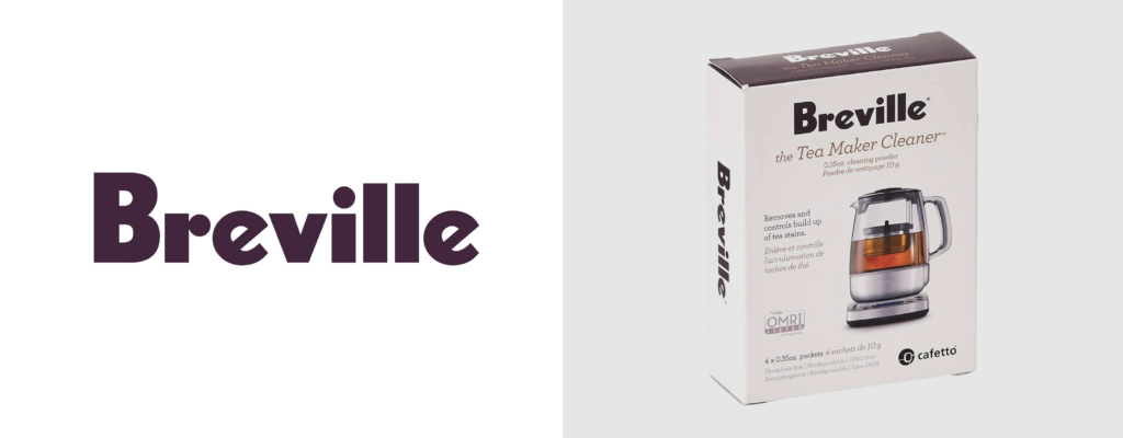
“Their industrial design is sleek and sophisticated, reflecting their high-end target market. The use of premium materials, intuitive user interfaces, and refined packaging reinforces Breville’s promise of quality. Even their logo—a minimal yet distinct sans-serif wordmark—communicates precision and reliability without overcomplicating the design.
“Breville’s branding is an excellent example of consistency. Every element, from product design to advertising, aligns to create a cohesive premium experience. It’s a lesson in how a brand can establish trust, confidence, and comfort by maintaining an unwavering commitment to quality at every touchpoint.
Final Thoughts
At Motion, we believe that great branding is part art and part science. Whether it’s a hospital network, a travel platform, a toy company, or a kitchen appliance brand, the best identities do more than just catch your eye—they capture your imagination and make you feel something. The creative teams behind these well-considered brands skillfully used design, messaging, and customer experience to underscore their core values and stand apart in their respective industries.
We take reflections such as these to heart in our own branding work, ensuring that each brand we touch is crafted with the same level of thoughtfulness, strategic intention, and creativity. Because at the end of the day, the best brands aren’t just seen—they’re felt.