Midwest Orthopaedics at Rush
To be your best, see the best.
the situation
Midwest Orthopaedics at Rush is a leader in innovative, evidence-based orthopedic treatments. Though consistently ranked best in Illinois, and among the nation’s elite, MOR’s brand recognition lagged behind its influence and prestige in the orthopedic space. The practice needed to reintroduce itself, touting its world-class credentials and quality of care to increase awareness and drive patient preference.
the acceleration
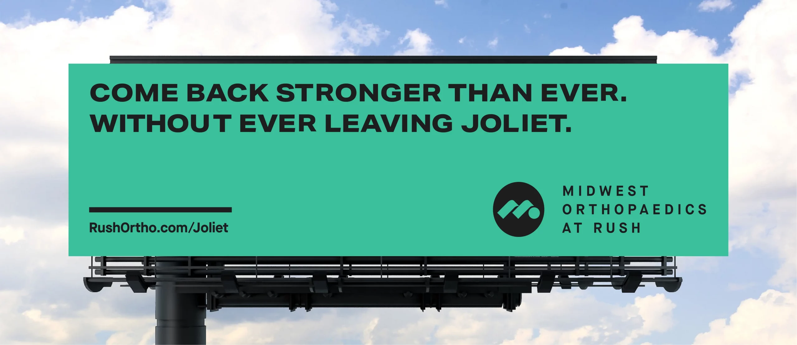
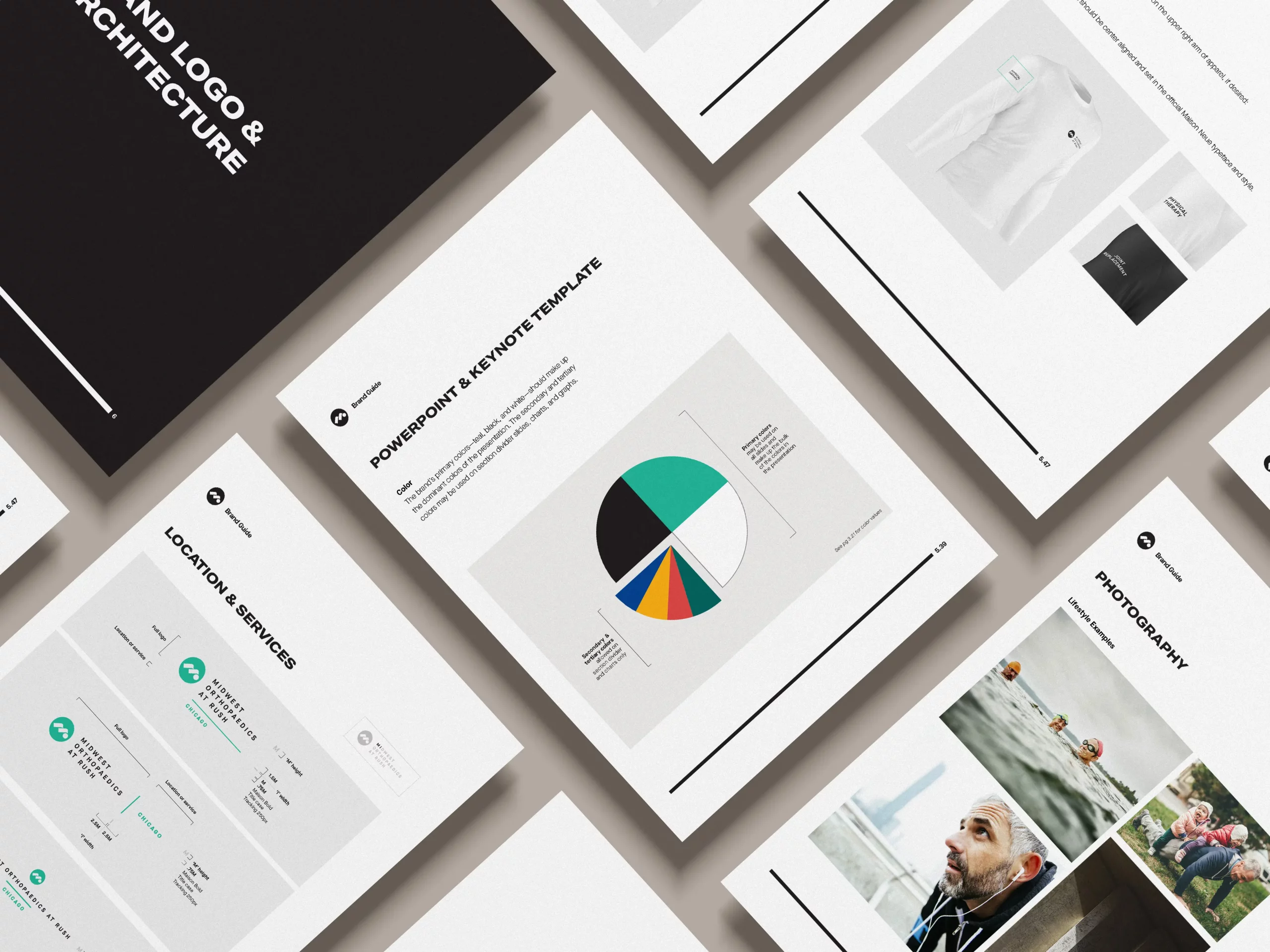
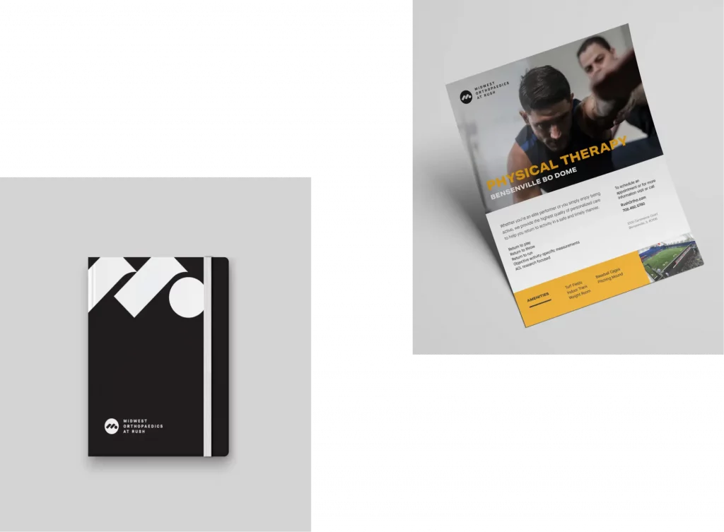
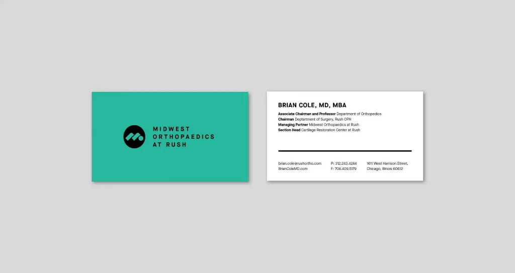
Motion executed a total brand refresh and a multi-phase brand campaign, complete with a new visual identity, tagline, and landing page. With a sleek, modern aesthetic and a messaging strategy built around MOR’s status as “the best,” the new brand appealed directly to its target audience of active, affluent patients who demand the highest quality care.
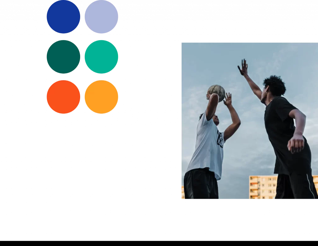
The elements of the refreshed brand projected a bold, modern new identity. An updated logo evoking forward movement. An expansive and eye-catching color palette. Dynamic lifestyle photography and animation. All together, these brand elements helped create something authoritative, energetic, even fun—a rare feat for an orthopedic practice.
“ ”
The Motion team has been an integral part of our brand refresh. We needed to communicate the level of service, innovation, and results that MOR delivers, and Motion eagerly accepted the challenge. They pushed the visual identity in an exciting new direction and evolved our brand voice to be more confident and reassuring. It’s really helped set us apart from the competition in a crowded market.
Alex Sroka, Director of Marketing
Midwest Orthopaedics at Rush
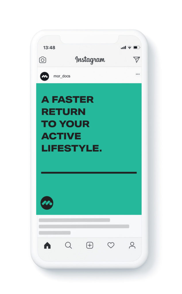
The bold colors, iconography, and language of the new brand translated seamlessly to social. It was a perfect medium for MOR’s concise and confident messaging, complemented by inspiring visuals and animation. Social also provided a platform to highlight the practice’s affiliations with professional sports teams and other prestigious organizations.