Rush
Built on excellence
the situation
In the Chicago healthcare landscape, providers don’t get more iconic than Rush. Founded two days before the city of Chicago itself, Rush has long set the quality standard across the region and nation. So when the opportunity came to help this storied health system through a comprehensive rebranding, we were humbled, honored—and giddy.
the acceleration
Our work began in fall 2017 with research to understand what people knew and believed about Rush. The news was good: Rush was a deeply respected brand. Yet there was a need to educate consumers across Chicagoland—one of the most competitive healthcare markets in the country—about the breadth of the Rush System and the specifics of ‘why Rush.’ The answer came straight from Rush bedrock: exceptional clinical care delivered by exceptionally kind people, a combination we dubbed the Rush DNA.

During our first year of work with Rush, Motion facilitated several hands-on workshops to surface ideas and alignment around the new Rush positioning strategy, employee brand, and 24-month marketing plan. By design, these sessions brought together stakeholders from across the Rush System.

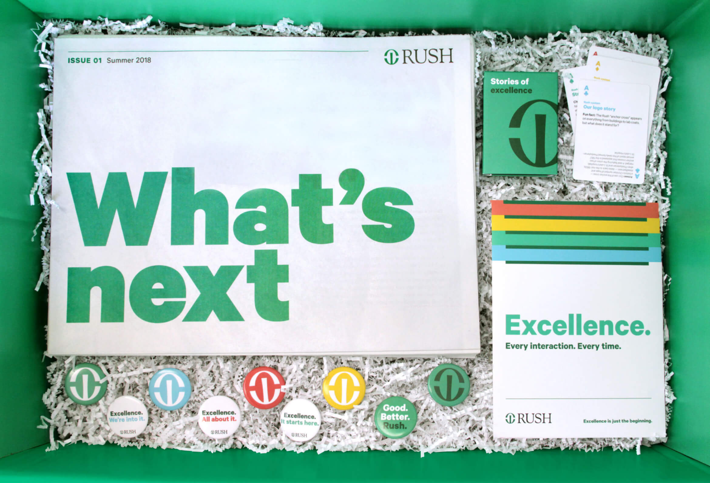
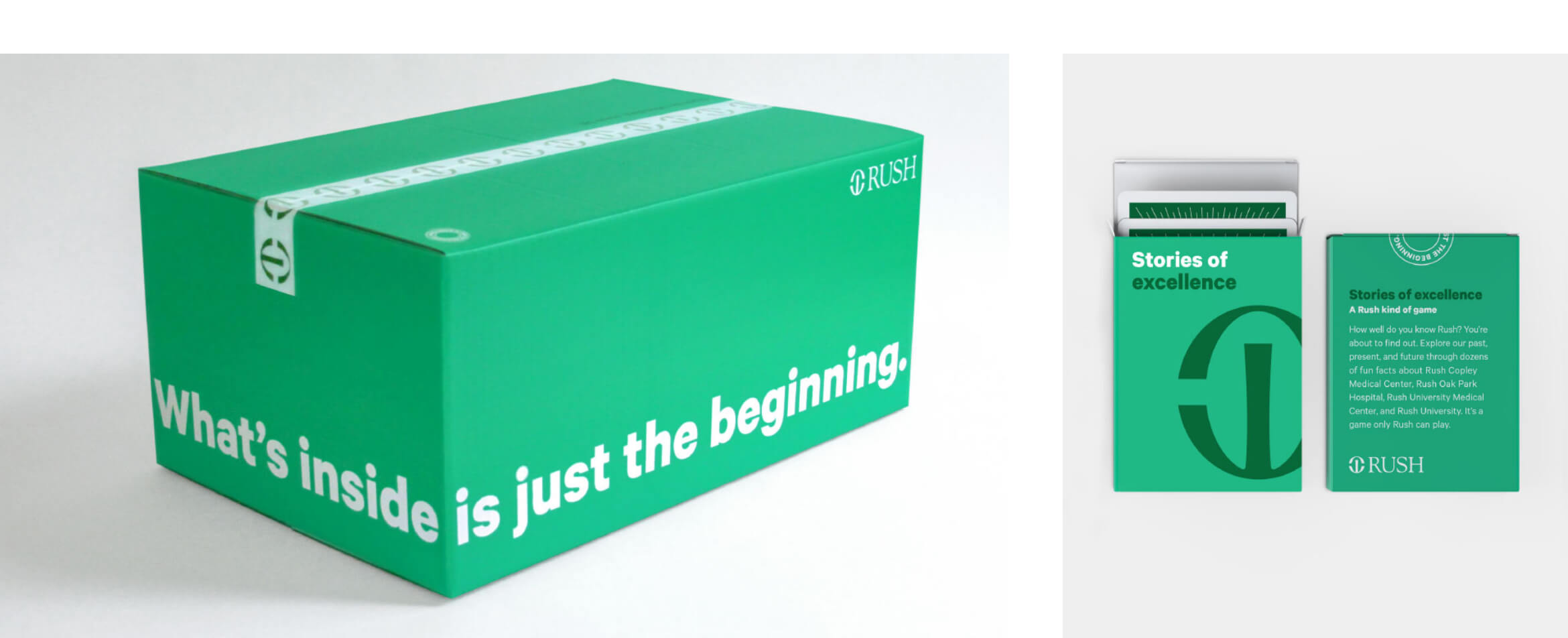
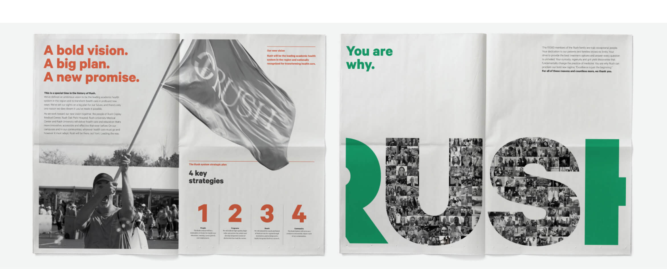
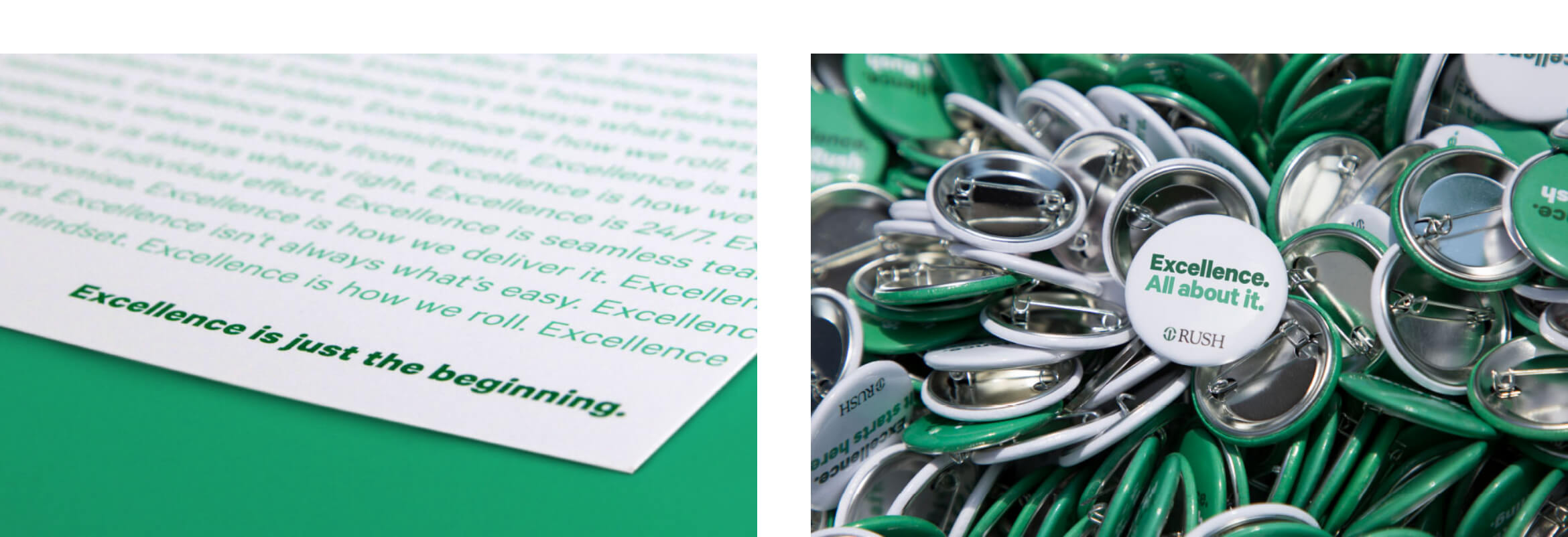
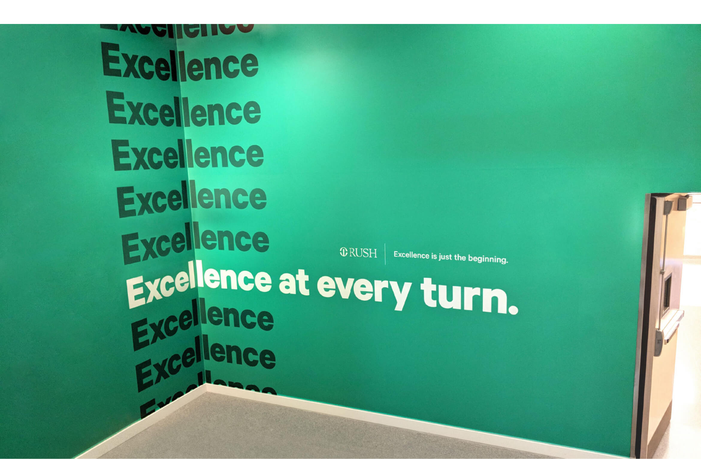
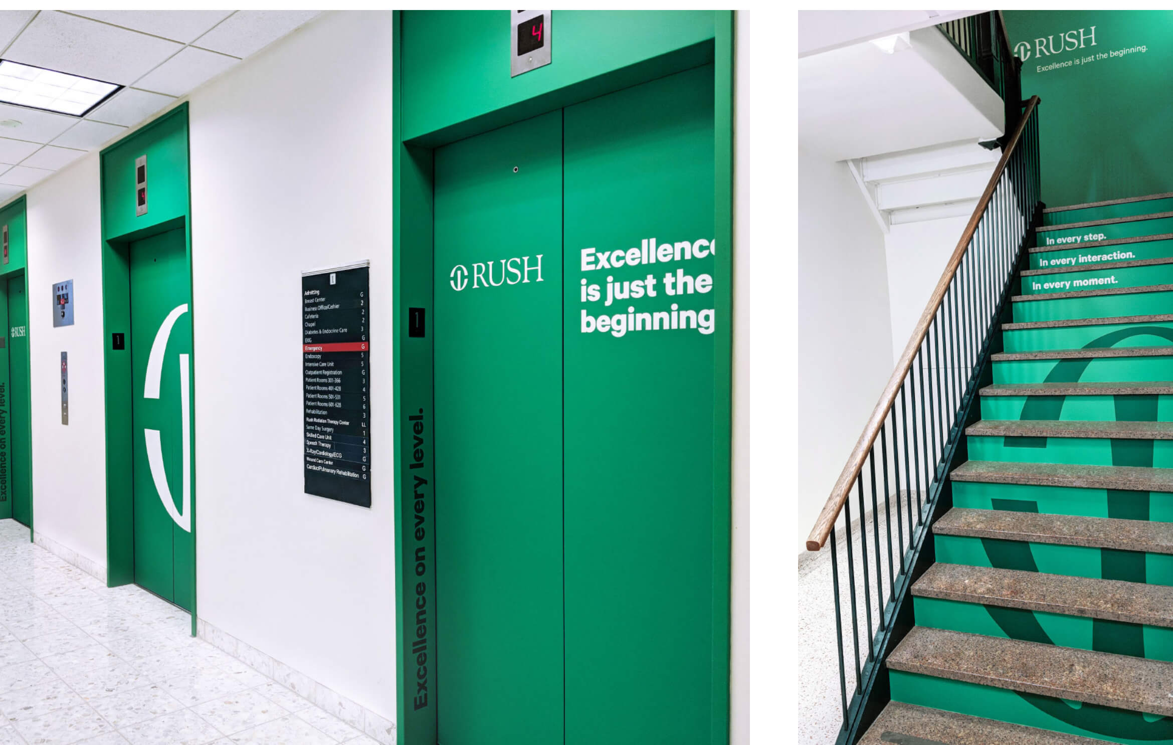
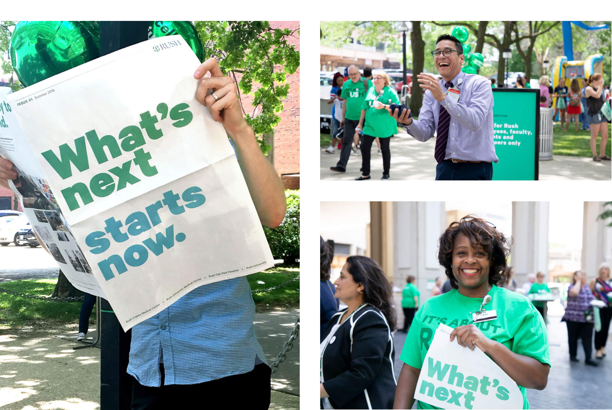
The first people to experience the new Rush brand were its 17,000 employees across Chicagoland. The largest internal launch in Rush history, the program included elements such as large-scale graphics installations at each Rush campus, a tabloid newspaper explaining the story behind the new brand, ‘event in a box’ kits sent to dozens of off-campus locations, and a proprietary deck of playing cards celebrating Rush history and current accolades.
“ ”
The work captures the connection between how we feel about what we do and how consumers feel about Rush. It’s been gratifying to hear from people across the system about how proud they are to see Rush everywhere.
Ryan Nagdeman
Associate Vice President, Marketing
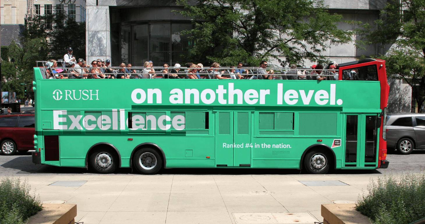
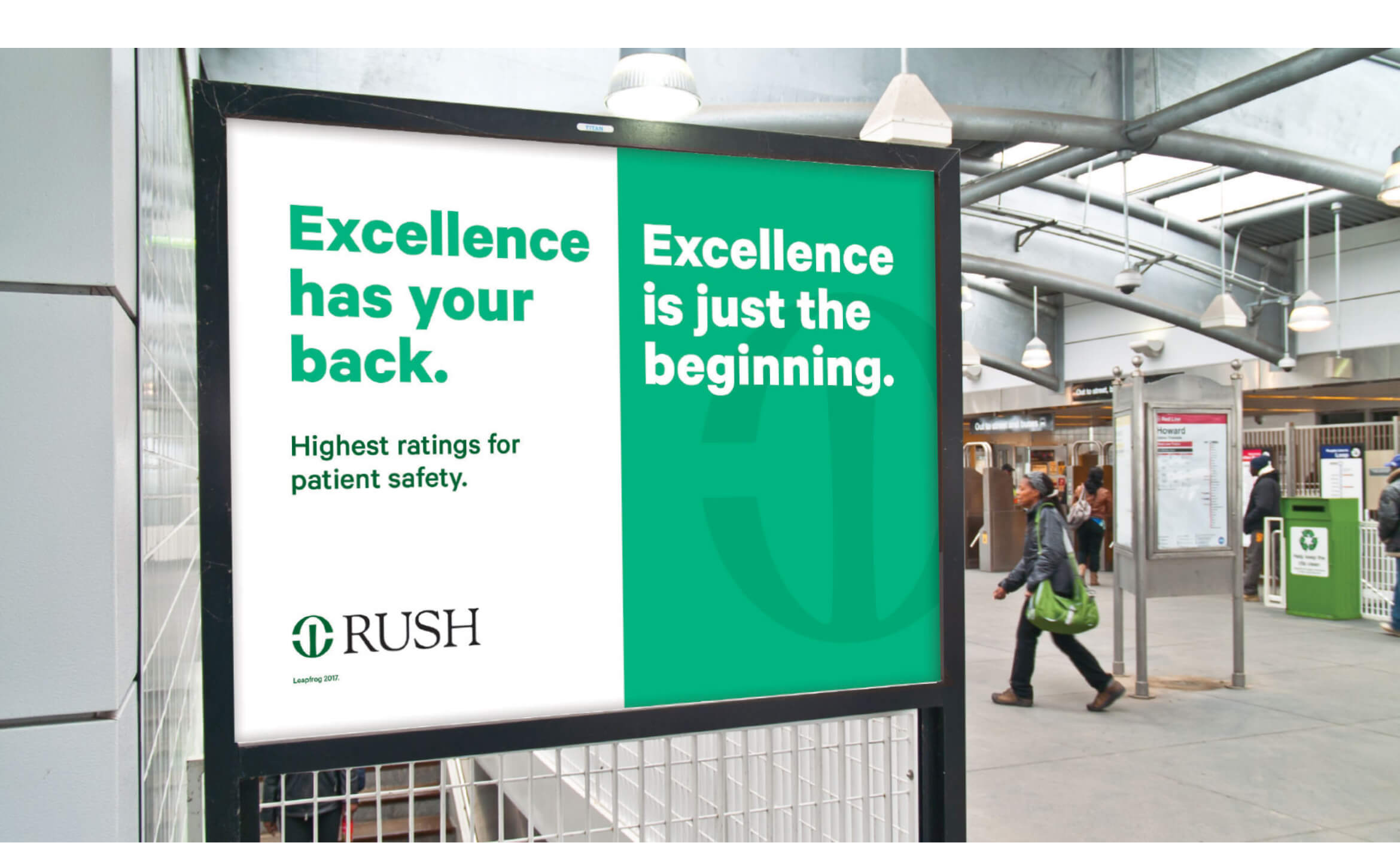
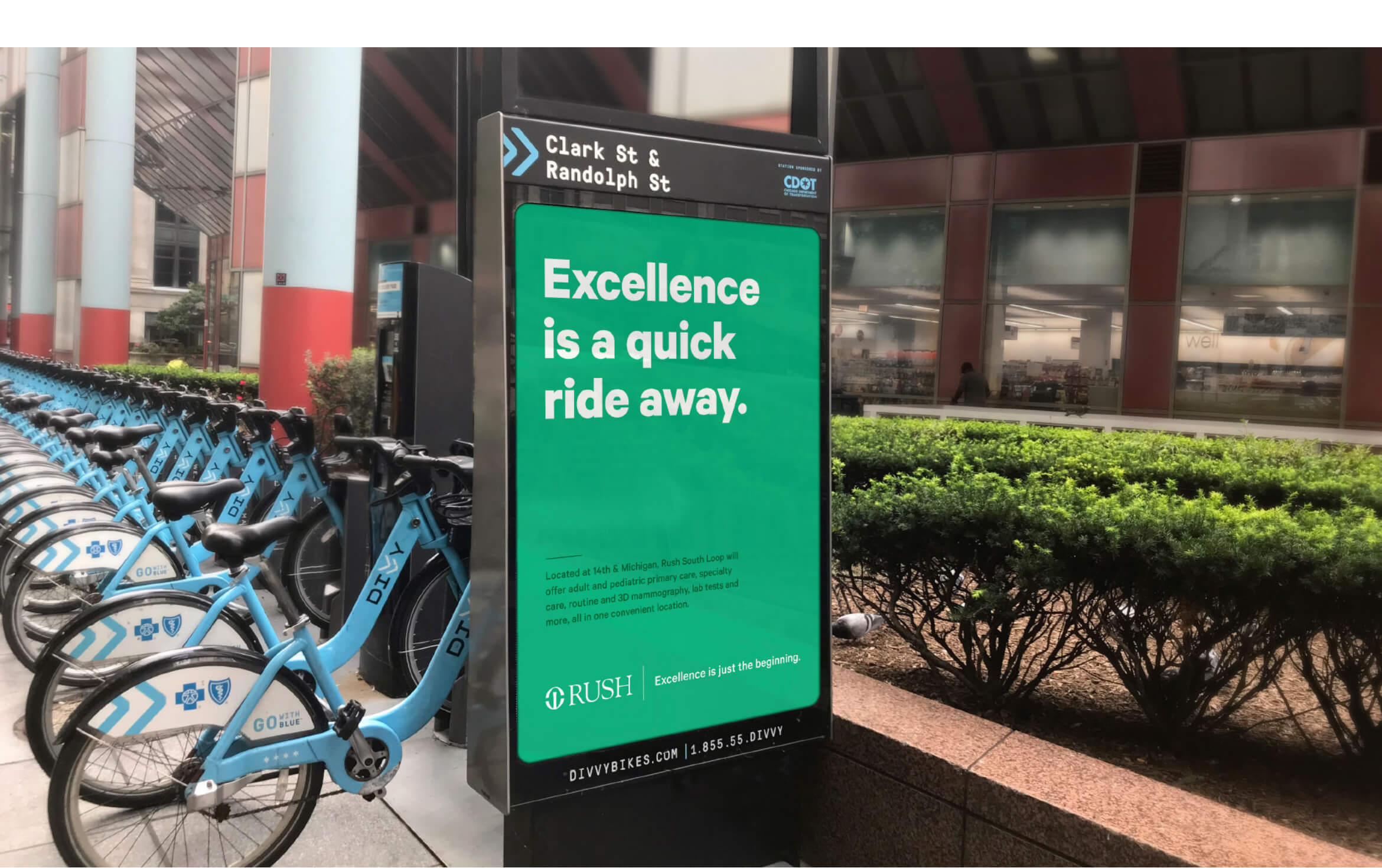
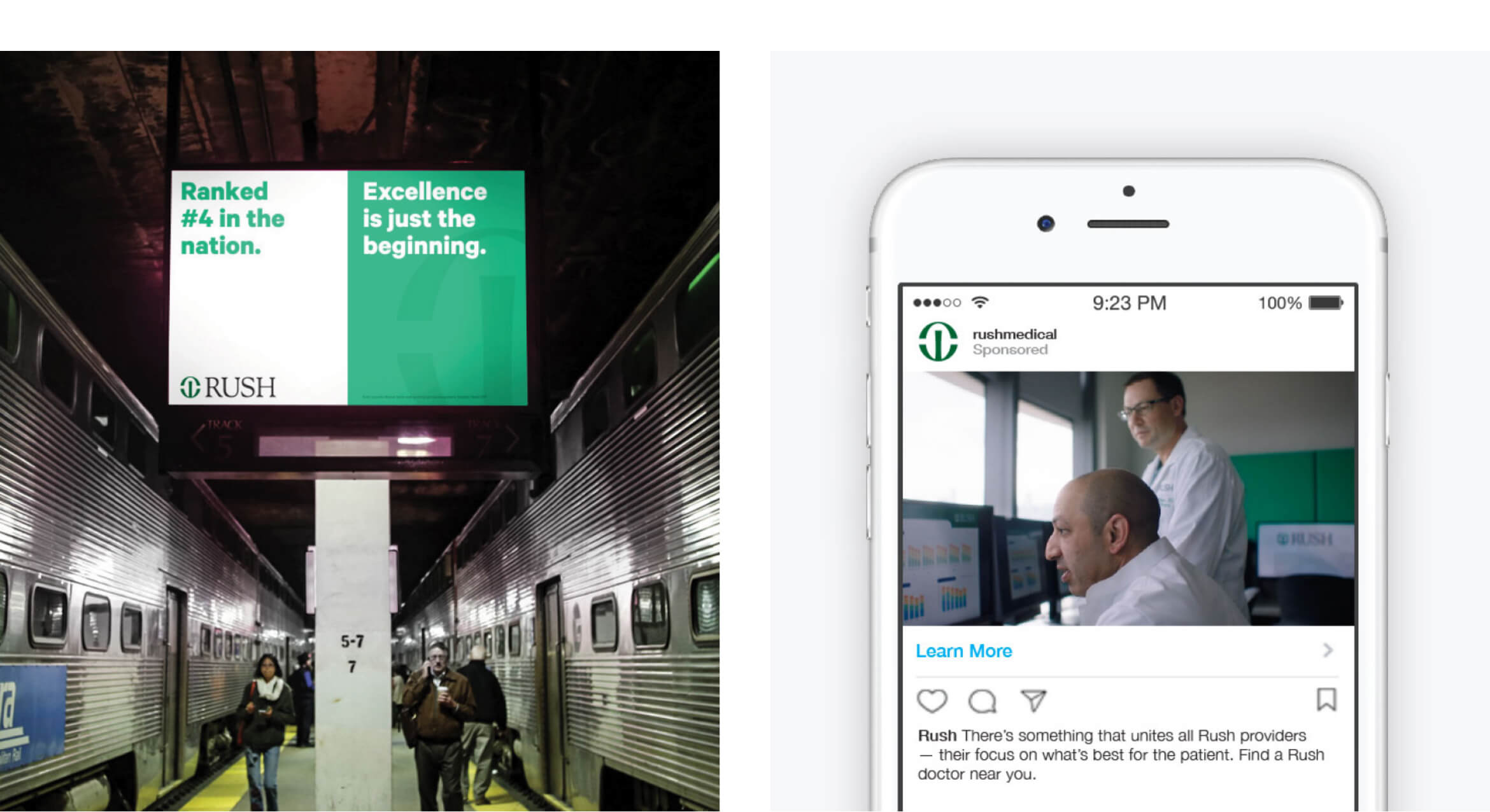
and its west suburban corridor by storm. At the heart of it all is the promise of excellence—a positioning strategy that honors the Rush heritage for exacting clinical standards—and a bold new shade of Rush green.
