Lightways
Through darkness, we bring light.
the situation
Since 1983, Joliet Area Community Hospice has built a legacy around compassionate care in the community. As the organization focused on their next phase, they realized they needed a new name and brand that still embodied their values, but could expand beyond their location-specific name.
the acceleration
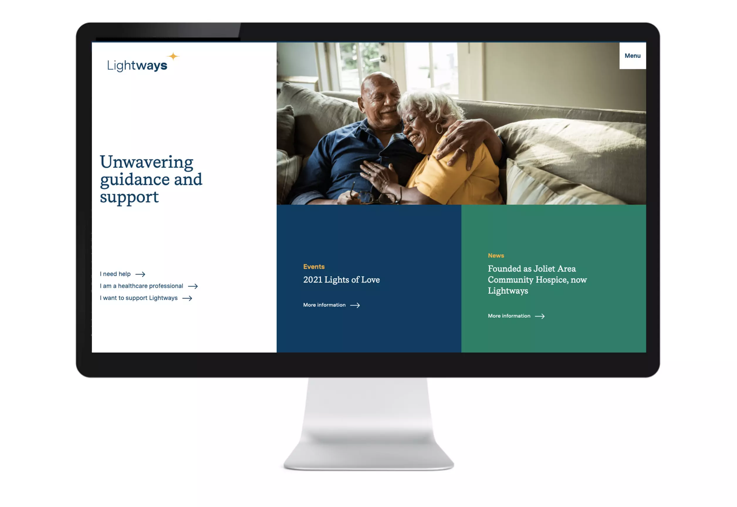
Motion developed a distinctive name, tagline, and brand that continued to represent exceptional care, kindness, and understanding. A brand box and video inspired their internal audiences. And an external campaign with radio, outdoor, print, collateral, and website introduced the new brand to the community.
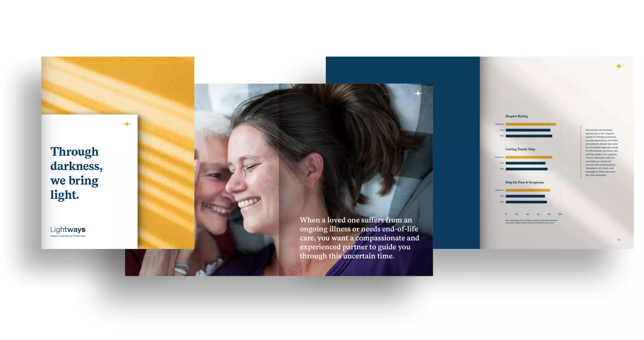
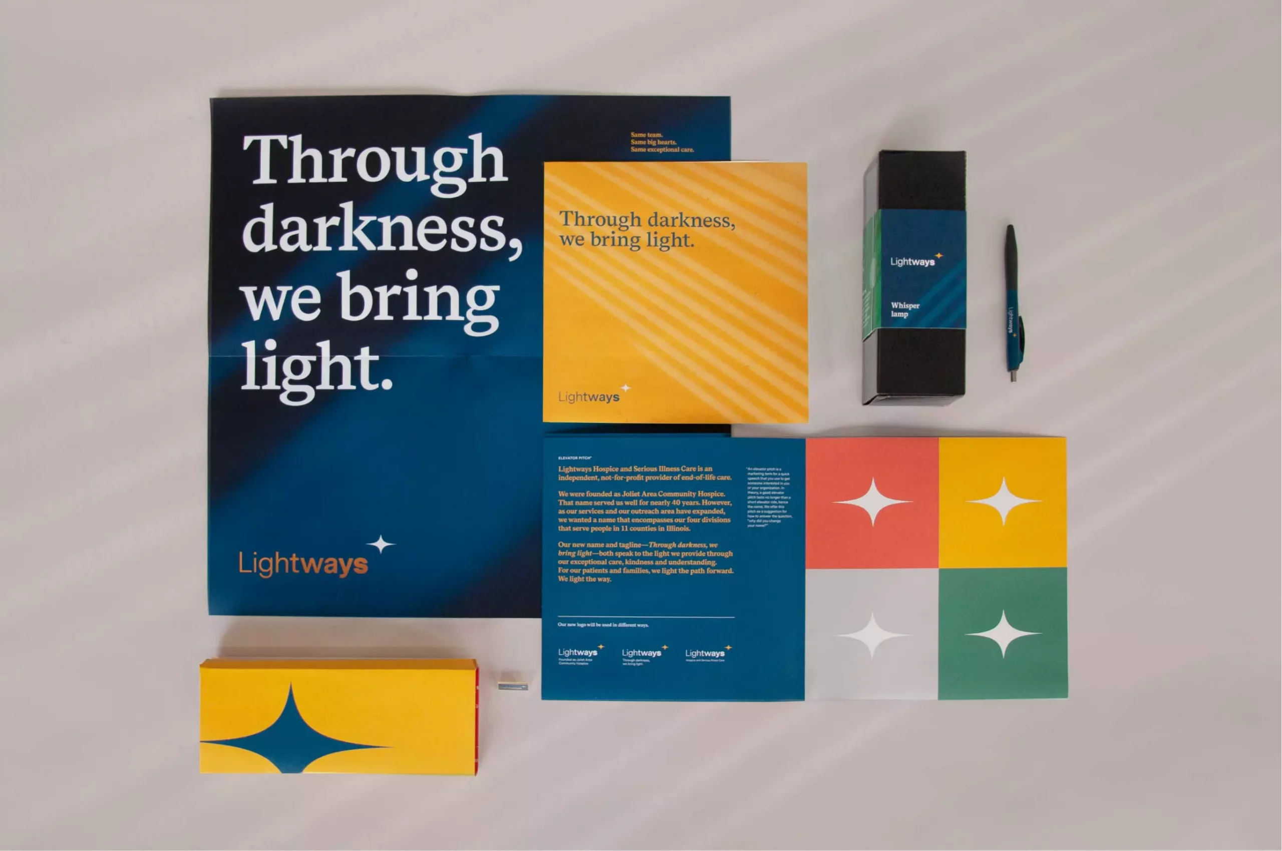
We refer to the new logo mark as a North Star or a spark. Either way, the meaning is clear: Lightways is a positive guiding force for every person in their care. Shadow textures further reinforce the light motif and bright colors emphasize a boldness and warmth.


To socialize the new name, brand, and tagline, we created an internal launch for employees and volunteers. A Zoom ‘unboxing’ event allowed the launch to build excitement across the company with everyone, simultaneously, while providing useful tools and resources.

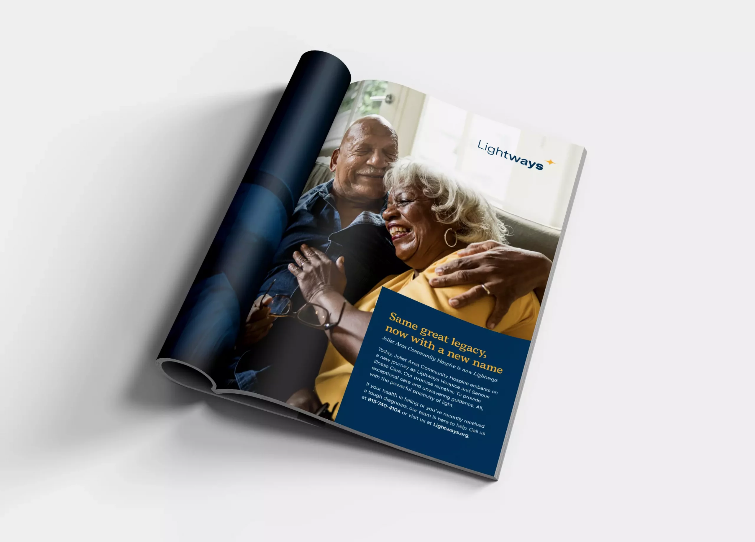
To Introduce the new identity to the public, we created a multi-dimensional brand campaign that included social, print, and digital media.

