Rush University
A campus refreshed
the situation
Rush University is a thriving, innovative institution inspiring the hearts and minds of future healthcare providers. Situated in the heart of the bustling Rush medical campus in Chicago, there was an opportunity to carve out a stronger identity for the University and refresh interiors throughout the 10-story facility.
the acceleration
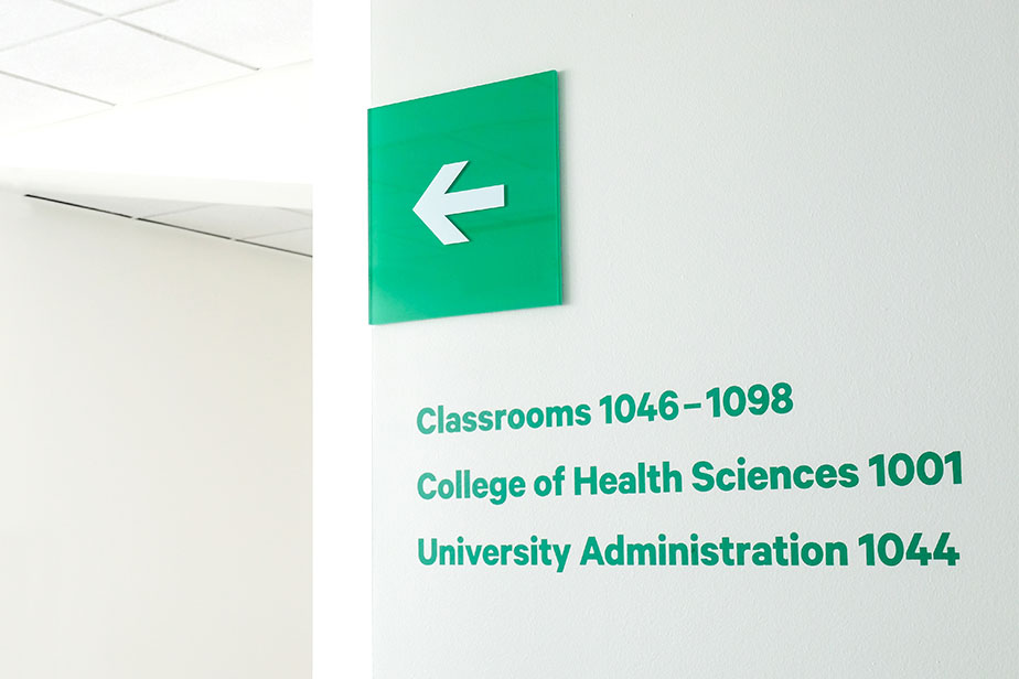
An extension of Motion’s rebranding for Rush, we began with an exhaustive audit to devise a phased approach to implementation, beginning with entry experiences and wayfinding. A singular design strategy guides it all: reflect the optimism and energy of young people devoting their lives to caring for others.
Breaking it down
Rebranding the interiors of a 10-story building, where to start? A thorough audit grouped interior spaces into functional categories and phases.
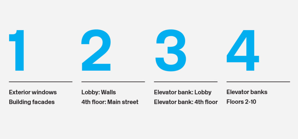
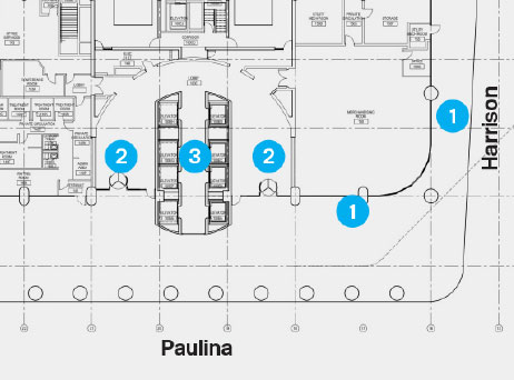
Our implementation plan correlated to blueprints of the Rush University building, streamlining communication between Motion and Rush facility staff.
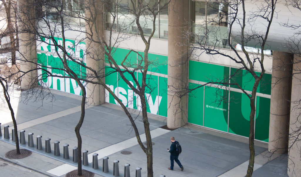
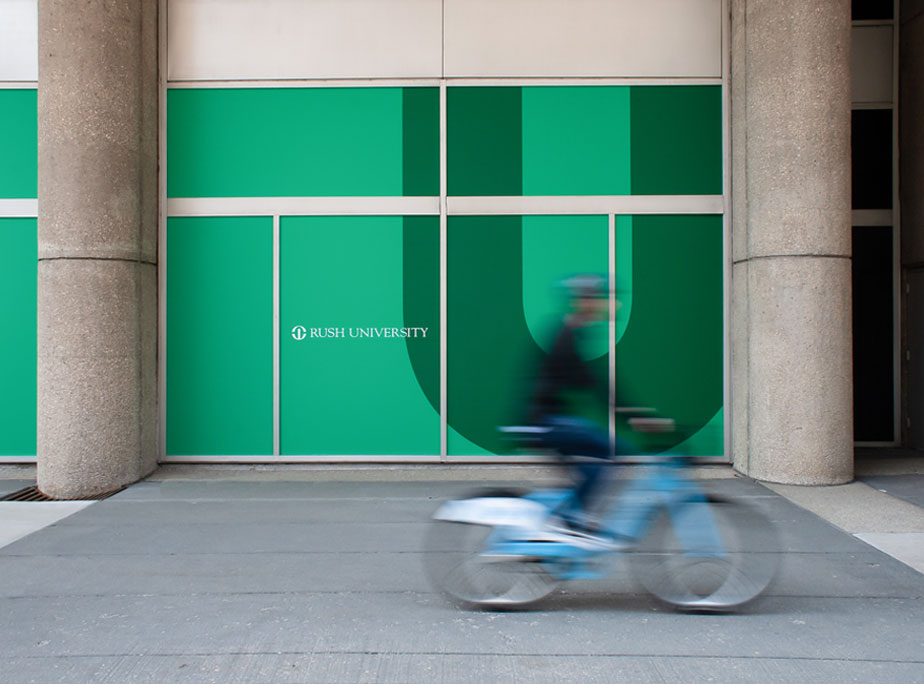
The reimagination of street-level windows marries a strong use of type and color with textural elements that frame the University bookstore

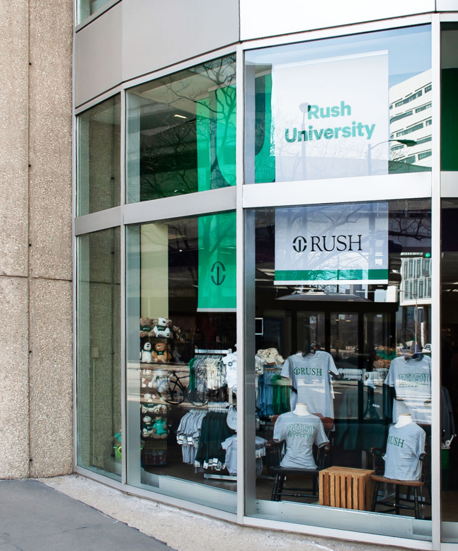


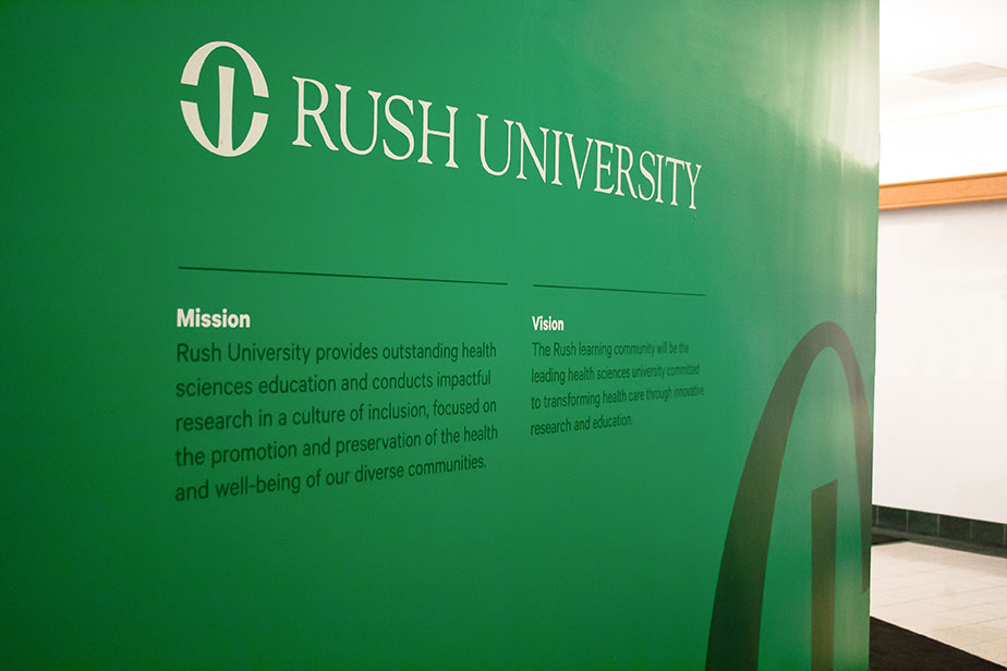
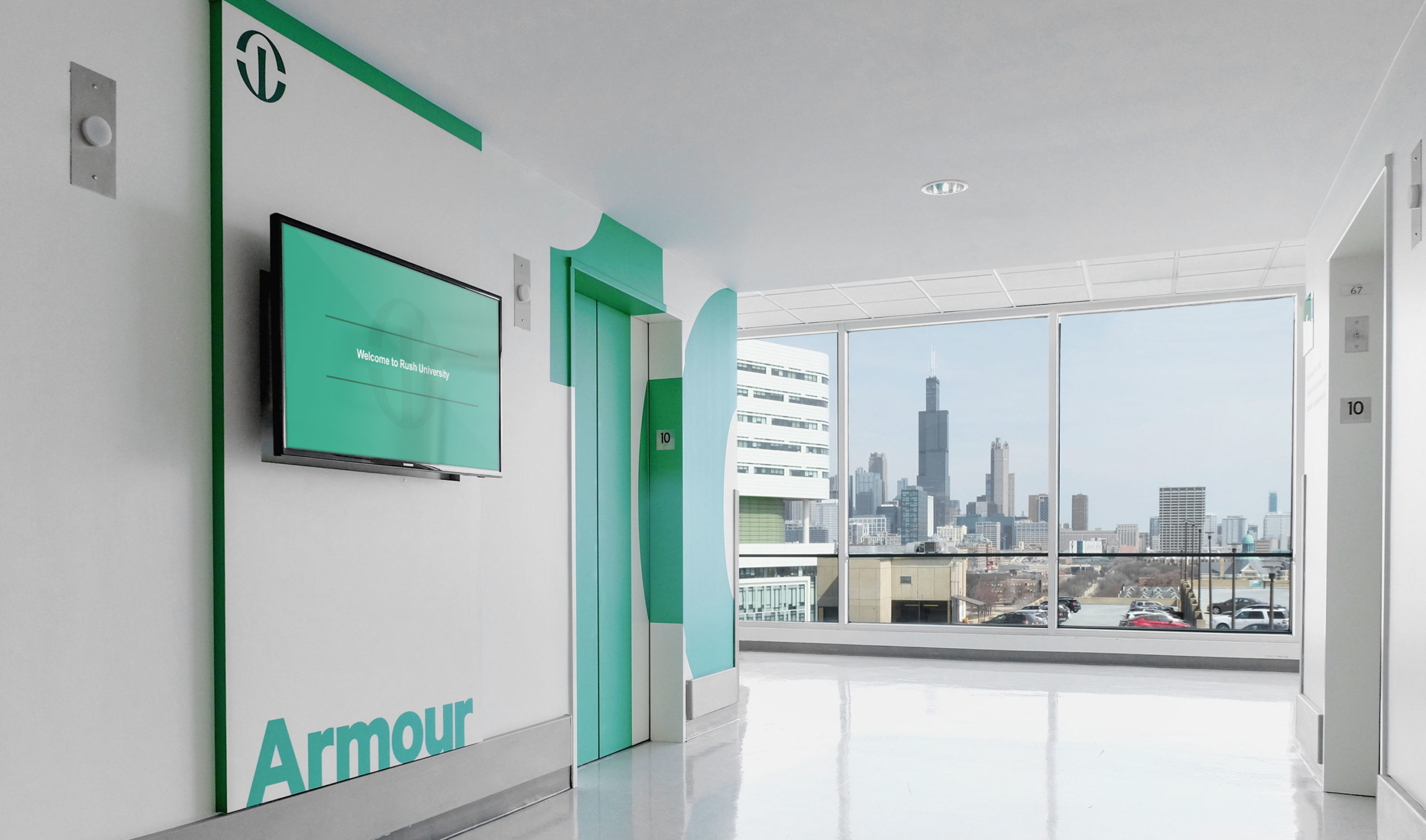
Refreshed entry spaces orient students and visitors to the building and proudly display the University’s mission and vision statements.

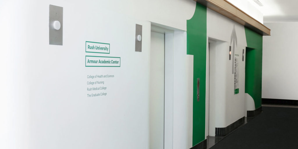
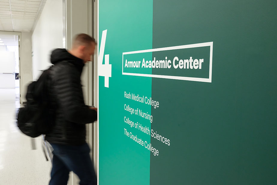
In several areas, University and hospital corridors intersect. The rebranding of this corridor clearly delineates which is which.
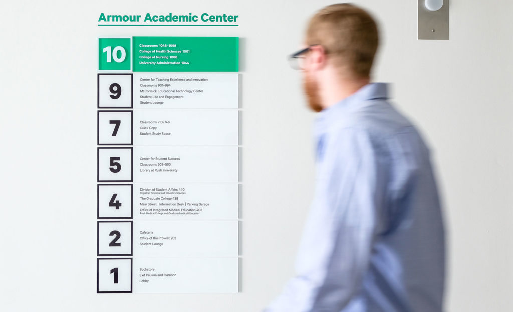
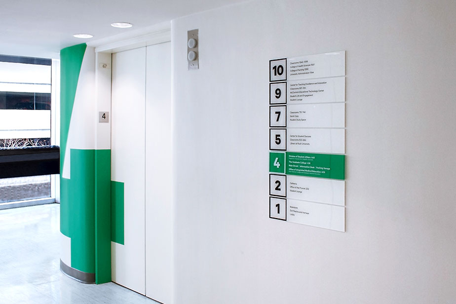
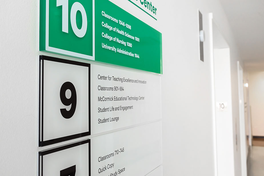


Large numerals and quotes from medical visionaries bring scale and impact to elevator banks on every floor.
